Why Cream and Powder Make Colour Read Differently
Why cream and powder makeup colour read differently: compare finish, layering and skin surface to choose a shade effect that suits the look you want.
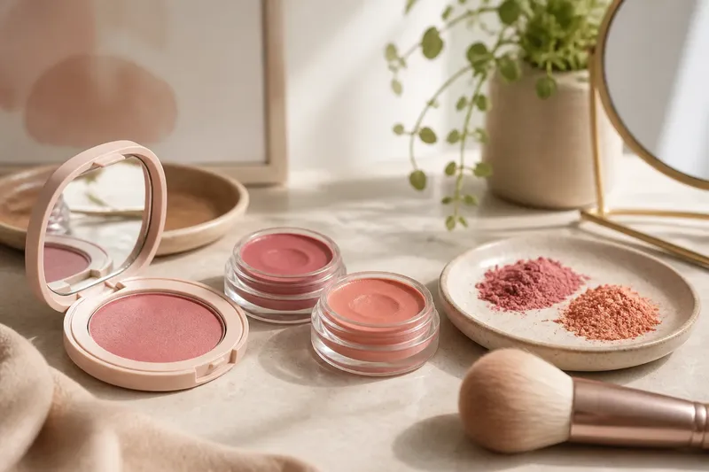
Why does the same blush look muted in a compact and vivid on your cheek? Cream and powder makeup colour read differently because a shade is never seen apart from its finish, the surface beneath it and the way light meets both. If the colour you see in the pan is not the colour you see on your face, the mismatch is often about texture rather than a faulty shade.
That distinction helps when choosing blush, eyeshadow, bronzer or lipstick. Instead of asking only whether a colour is warm, cool or bright, consider whether its finish will add shine, soften edges, cling to dry patches or sit visibly on top of the skin.
Finish changes colour
A powder product usually leaves a layer of fine particles on the skin. A matte powder scatters light in a subdued way, which can make colour look softer or more opaque. A satin or shimmer powder reflects more light, so the shade may appear brighter in some angles and less even in others.
Cream products tend to leave a more continuous, flexible-looking film. A sheer cream blush may let some of the skin’s natural tone show through, while a highly pigmented cream can appear bold because it lays down colour in a concentrated area. Dewy surfaces also catch highlights, which can make the colour seem more luminous without making the pigment itself stronger.
These are tendencies, not fixed rules. A finely milled powder can look almost transparent, and a cream can dry to a matte finish. Look at the product’s finish description and, where possible, observe a swatch on skin rather than relying on the colour in the container.
Colour shifts on skin
The skin underneath acts like part of the colour mixture. Its undertone, visible redness, freckles and natural variation can alter how a sheer product appears. A peach blush, for instance, may read pinker over cool-toned skin or more orange over a warmer surface, while a dense formula may cover more of that underlying colour.
Texture affects this interaction. Powder can catch on dry areas and look patchy, making the shade seem darker or more saturated in those spots. Cream may move more easily across a moisturised surface, but can gather where skin is oily or where another product has not settled.
Check the colour in the light where you expect to wear it. A bathroom mirror with cool overhead lighting can make a warm bronze look less golden than it does beside a window; changing the room will not change the product, but it can change your judgement of it.
When colour looks dull
A powder shade that seems vivid in its pan but disappears on the face may be too close to your skin tone, too sheer for the effect you want or softened by a matte finish. It may also be sitting over a base product that has left the surface slippery, so the powder is not laying evenly.
Try these checks in order:
- Compare the shade with your bare skin and with your usual base product; a sheer colour can blend into either.
- Look for a finish description such as matte, satin or shimmer, then decide whether that light response suits the intended effect.
- Apply a small amount with a clean brush, then add another light layer only if the colour still looks too faint.
- If the product skips over the surface, allow moisturiser or foundation to settle before applying it again.
- Check the result in indirect daylight, then compare it with the lighting in which you normally wear makeup.
Imagine you choose a muted rose powder for a soft cheek colour, but it vanishes over your usual foundation. If the shade is close to your skin and the finish is matte, try a slightly richer rose in the same finish before switching to shimmer; the expected visible change is clearer colour without adding more shine.
When colour looks too strong
A cream can look unexpectedly intense because a small amount of concentrated pigment spreads into a broad, even film. A reflective finish can add to that impression, especially on raised areas such as cheekbones. The shade may be appropriate; the amount or placement may simply be doing more than intended.
Start with less product than you think you need and build it gradually. For cream blush, tap a small amount onto the back of a clean hand first, then pick it up with fingers or a dense brush and blend at the edges. Avoid rubbing hard over the skin, which can disturb the layer underneath and leave the colour uneven.
If the result remains too vivid, soften it with a thin layer of your usual base product or choose a more muted shade. Do not add powder automatically: it can change the finish and deepen the appearance if the underlying cream is already concentrated.
When layers turn patchy
Patchiness often comes from unlike textures competing on the same area. Powder applied over a tacky cream can form clumps, while cream moved over a powder base can lift or drag the powder into streaks. The result may look like a colour problem, though the difficulty is in the order and surface.
Keep the layers compatible where you can. Let a cream product settle before adding powder, and use a light touch with a soft brush rather than pressing more pigment into one spot. If you prefer a powder base, try powder colour over it; if you prefer cream, keep the surrounding layers thin and avoid repeatedly blending across the same patch.
When a product’s label or manufacturer instructions specify how it should be applied, follow those directions. Formulas differ, and a finish name alone does not tell you how a particular product behaves over every base.
Which texture suits the effect?
Choose by the surface you want, not by a rule that one formula is universally better. Creams can give a fresh, blended look and are useful when you want colour to appear integrated with the skin. Powders can offer a soft-focus or more defined effect, and they are often easier to layer over a set base.
For a subtle flush, a sheer cream may let the skin show through. For a blurred cheek, a matte powder can soften the edges of colour. For a luminous accent, either a reflective cream or a shimmer powder may work; the difference is whether you prefer a smooth sheen or visible particles catching the light.
Compare one feature at a time: finish, opacity, then how the product sits over your usual base. This keeps a shade decision from becoming a debate between two products that differ in several ways at once.
Questions about texture?
Is cream makeup always more natural-looking?
No. A sheer cream can look like a soft tint, but a strongly pigmented formula can produce a distinct, saturated patch. The finish and amount matter as much as the category on the package.
Why does powder look darker in some areas?
Powder may collect on dry patches, texture or uneven layers of base, concentrating colour where it settles. Use a lighter application and check whether the skin surface is smooth and set before adding more.
Can cream and powder be worn together?
Yes, but the layers usually behave better when the cream has settled before powder goes on. Use a small amount of each and avoid repeatedly brushing back and forth, which can disturb the layer beneath.
How can I compare shades fairly?
Compare them on the same area of skin, under the same light and over the same base. A swatch on the hand can help with undertone, but the face is the better place to judge how a blush or bronzer’s finish will read where you plan to wear it.
Choose the surface
When a colour disappoints, first decide whether the problem is its shade, opacity, finish or contact with the skin. That small diagnosis prevents replacing a suitable colour when a lighter layer, a different surface or a less reflective finish would answer the question.
For cream and powder makeup colour, the useful comparison is not simply which looks brighter in the pan. Look at the effect on your skin in your usual light, and choose the texture whose surface does the work you actually want.